--nc-blackPrimary ink
--nc-inkBody ink
--nc-mutedSecondary ink
--nc-lineBorders
--nc-line-lightSubtle borders
--nc-paperPaper
--nc-deepDeep background
--nc-errorError
--nc-liveLive
--nc-wakingWaking
--nc-quietQuiet
--nc-troubledTroubled
--nc-space-14px
--nc-space-28px
--nc-space-316px
--nc-space-424px
--nc-space-532px
--nc-space-640px
--nc-space-748px
We make room for what’s next.
Section heading
Body copy stays clear and measured, with muted text for supporting information.
Eyebrow / 12px / uppercase
Text link with underlinesearch16 / 24 / 32pxaccount16 / 24 / 32pxheart16 / 24 / 32pxbag16 / 24 / 32pxmenu16 / 24 / 32pxclose16 / 24 / 32pxarrow16 / 24 / 32pxminus16 / 24 / 32pxplus16 / 24 / 32pxback16 / 24 / 32pxcheck16 / 24 / 32px Nocha
We make room
for what’s next.THE HOUSE OF NOCHA
Un espace pour les idées qui deviennent des mondes.The measure stays wide. Supporting copy sits to the right.
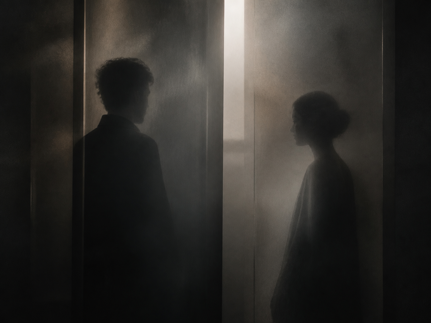
How I Met
Des rencontres qui ont une histoire.Human first
Start from desire, gesture and story.
Distinct by design
Each product keeps its own identity.
Quiet intelligence
Powerful underneath, natural in form.
Desktop
Quiet luxury, generous type, thin lines.
The wordmark sits on the left. Navigation sits on the trailing edge. Content uses a wide editorial measure.
Mobile / 390px
Same hierarchy, closer reach.
Content stacks, menu access moves to the edge and actions become full width.
Design-system toast is visible.